
Since most of our users are from the USA, FunCorp decided to update its icon and splash screen for the Halloween holidays last year. Let’s recall that story. The task seemed trivial, but in the process, we found some more cases and grew our essential checklist from 8 to 13 items (attached).

This isn’t rocket science; I’ll tell you what you should pay attention to in such tasks to avoid letting unnecessary bugs into the prod, both on Android and iOS.
So, here’s what we expected to get in the holiday update:

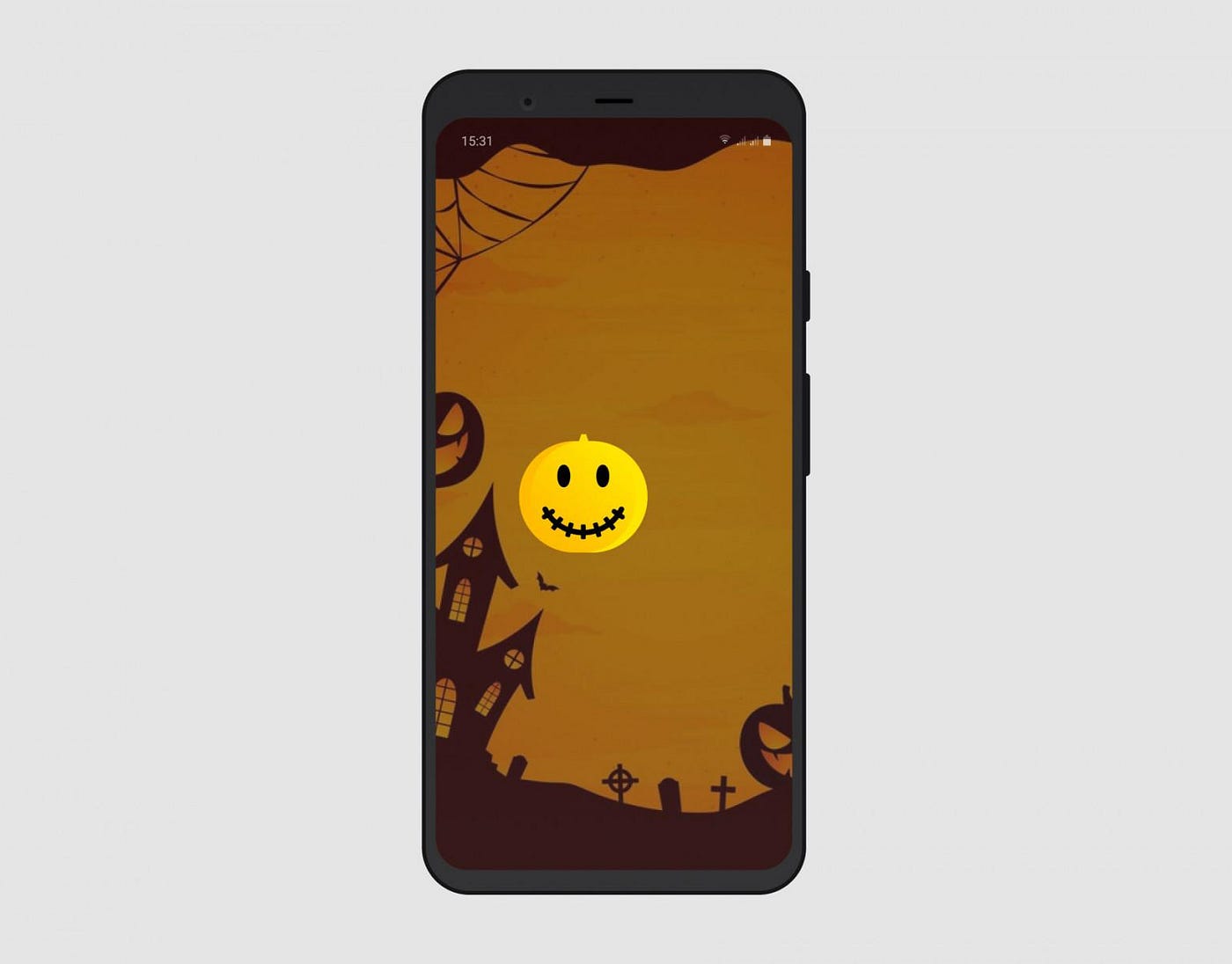
Update for our icon
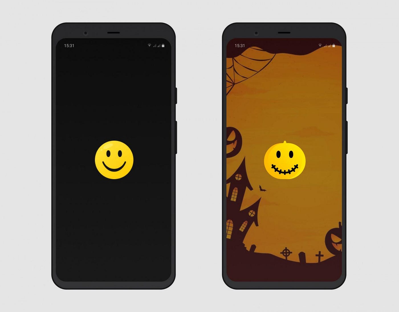
And splash update
“It’s just an icon and a splash screen,” I thought and immediately threw together an essential checklist.
- Updating the app.
- Clean installation.
- Start → minimize.
- Minimized in recent apps.
- Adding an icon to the home screen (Android only).
- Different screens.
- Different OS versions.
- Splash screen.
However, I’ve yet to see a task without bugs, so I turned to Google to see what pitfalls the community knows. Next, I will tell you what you can expect during testing, and at the end, I’ll show my updated checklist.
Android issues
The first thing that comes to mind is that there are lots of devices with different features on Android, hence most of the problems.
Problems with the icon rendering
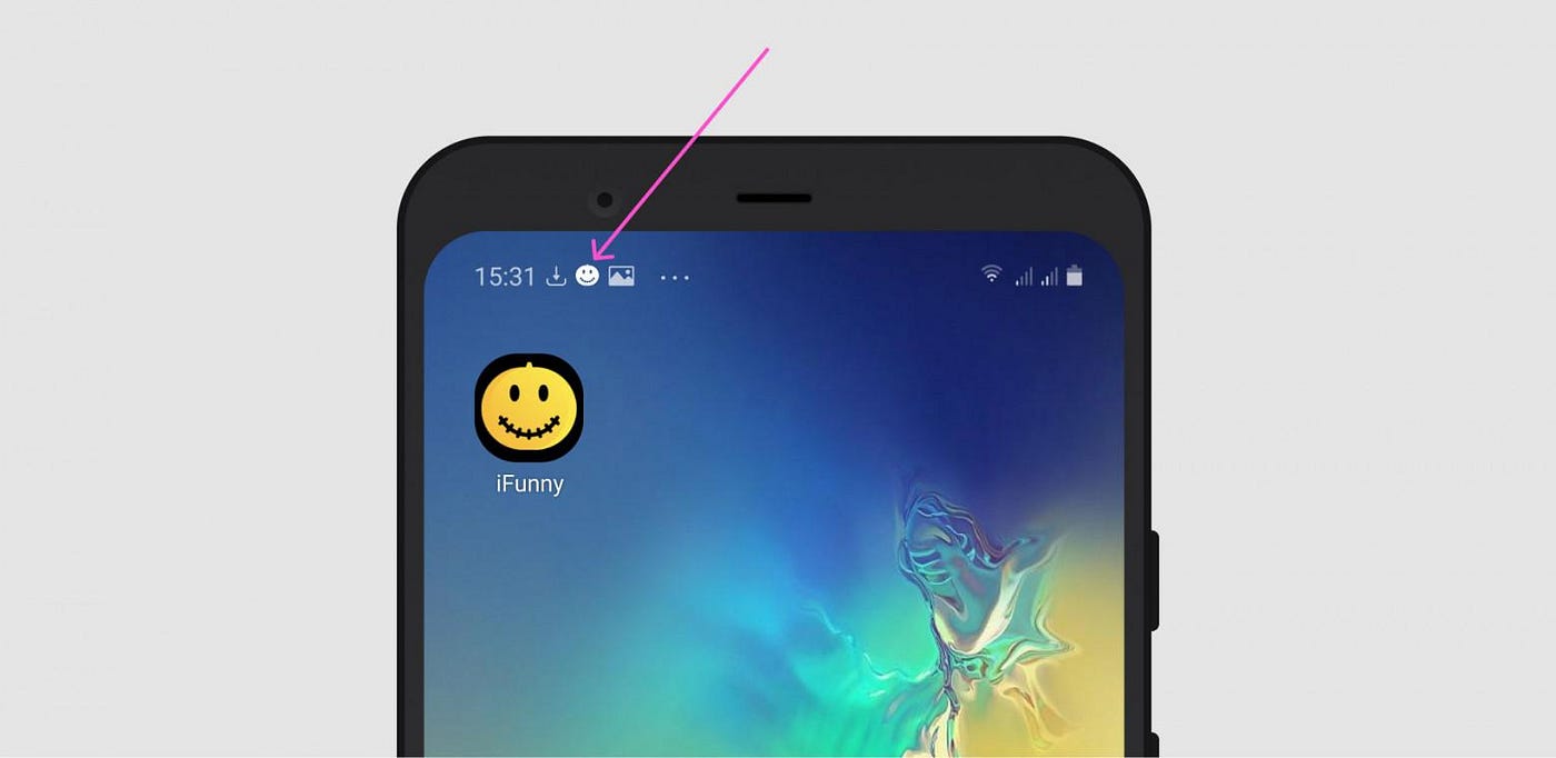
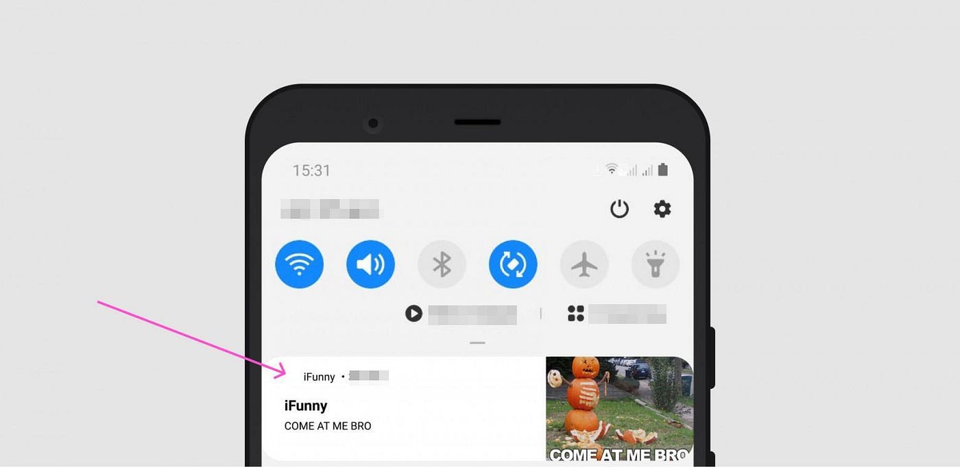
In addition to basic checks, it is worth paying attention to push notifications since they’re crucial for retention. In our case, the icon in the status bar was brighter than needed; when under the shade, it merged with the background:
The icon may also look crooked in different icon shapes:

Android 10/Pixel
Adding to the checklist:
- Icons in push notifications
- Different icon shapes.
Splash screen
The splash screen is somewhat more complicated than icons, so an extensive range of devices and fragmentation is expected to affect it. If your splash is like ours, consisting of two parts (the background and the logo), there are even more issues.
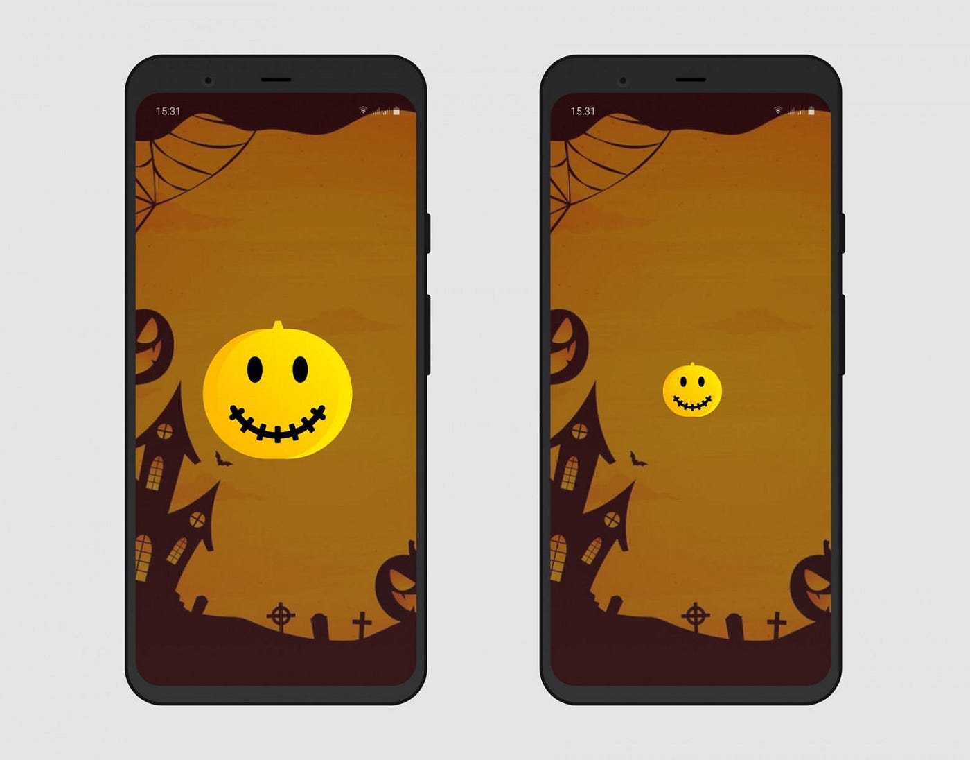
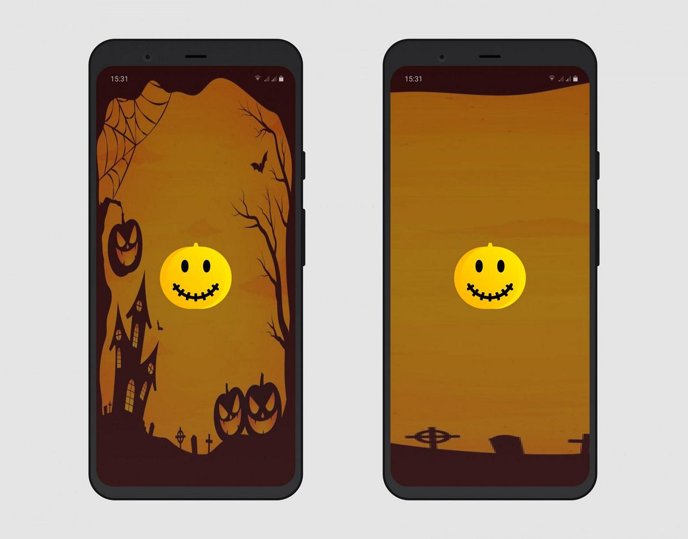
For example, a different logo may be smaller or larger than expected:
Stretched or compressed:

Not centered (if this is not expected):
Now let’s consider possible problems with the splash screen background.
It may hide under virtual buttons:

Get compressed or stretched:
Give you the same centering problems as the icon:
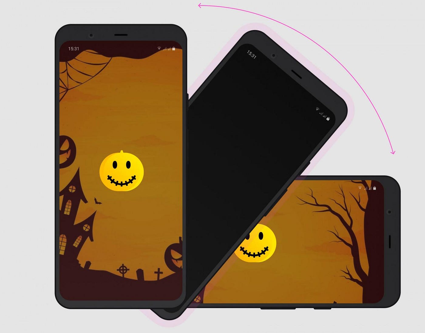
Screen rotation is quite often a bottleneck, as there may be an unpleasant flicker of the splash screen:
On top of that, we add the following to the checklist:
- Screen rotation.
iOS issues
I expected fewer problems with iOS since there is usually adaptability for supported OS versions and devices. Indeed, it was just as I expected.
Do not rush to click Tested, though: the main problem is the OS's caching of the icon and splash screen.
Icon
It did not cause any particular problems, except when searching for an app on the device, and in recent apps, the old one was sometimes rendered. The bug was not reproduced consistently, so we decided against fixing it, as there were non-minor priority tasks. We have not received any complaints from users yet.
Here’s what we add to the checklist:
- App search on the device.
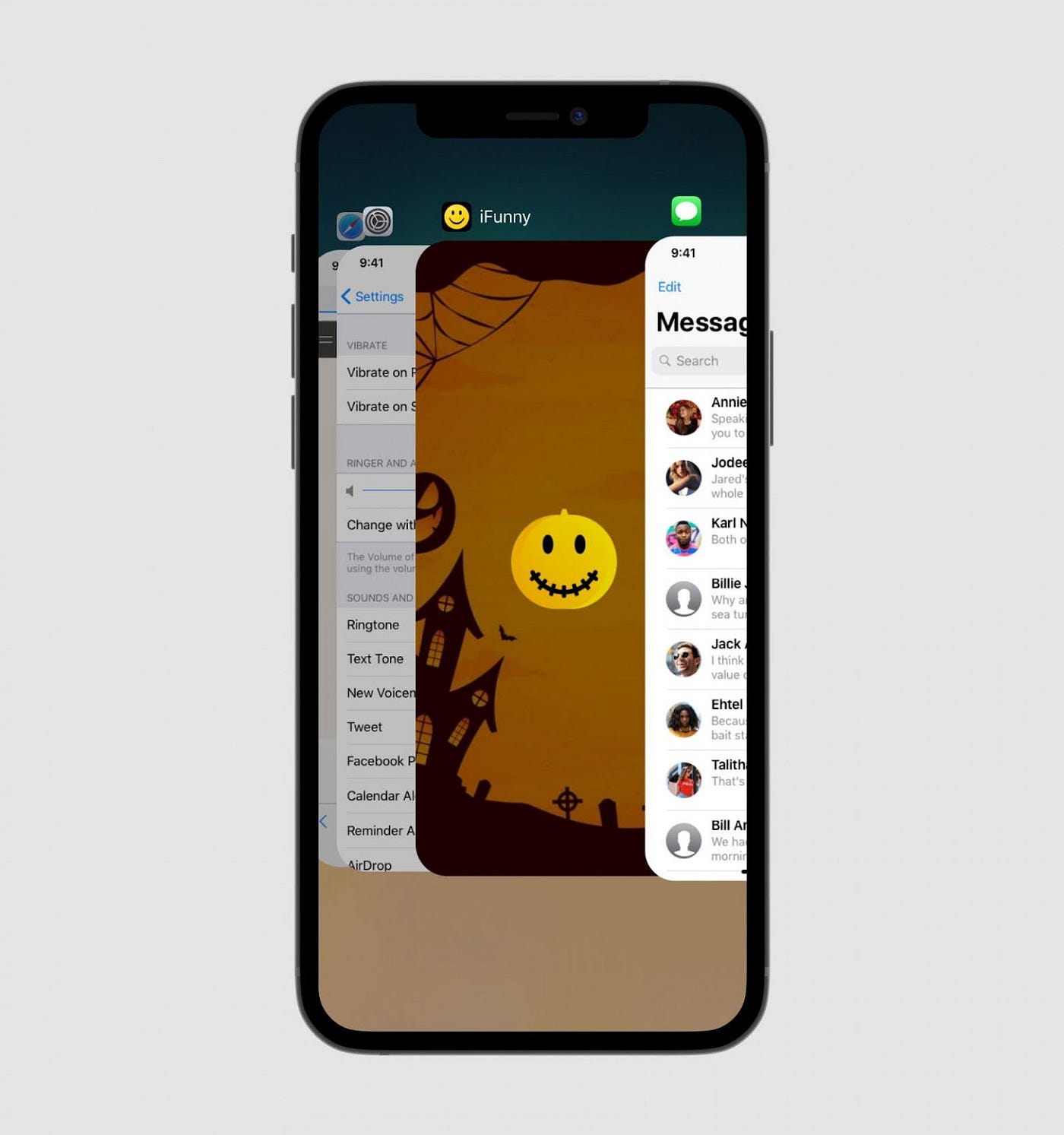
- Minimized app in the recent list.
Splash screen
After updating the app, the old splash screen was first shown, then changed to the new one. Meanwhile, the cache couldn’t be cleared by deleting the app or restarting the device.

Here’s what users could have seen, but fortunately, it didn’t reach them
We found a solution, though. One way is to clear the cache, as suggested in this article.
Here we add a note: “don’t forget about caching on iOS.”
Final checklist
I added six new items, and now the list looks like this:
- App update + don’t forget about caching on iOS.
- Clean installation.
- Start → minimize.
- Minimized app in the recent list.
- App search on the device.
- Different screens.
- Screen rotation.
- Different OS versions.
- The icon in push notifications.
- Different icon shapes.
- Adding an icon to the home screen (Android only).
- Splash screen.
- Splash screen with virtual buttons (Android only).
In the end, I can say that such a list would be handy to the developer and me back where we started; we could’ve cut down on the number of development-testing iterations.
If you also encountered non-trivial issues and ways to tackle them during testing, please let me know so that we can add them to this list together.